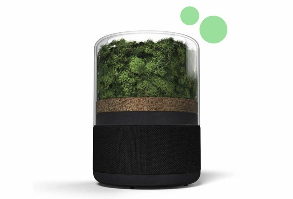
Briiv is quickly becoming an exciting new product designed to purify the air whilst being environmentally friendly. It’s this particular USP that pushes the Briiv Air Purifier above its competitors, and allows it to stand out from the crowd, as others use products that can be harmful to the environment.
When creating Briiv’s visual identity, our main objective was to communicate this powerful story to the consumer, whilst maintaining a sophisticated yet approachable personality to the brand.
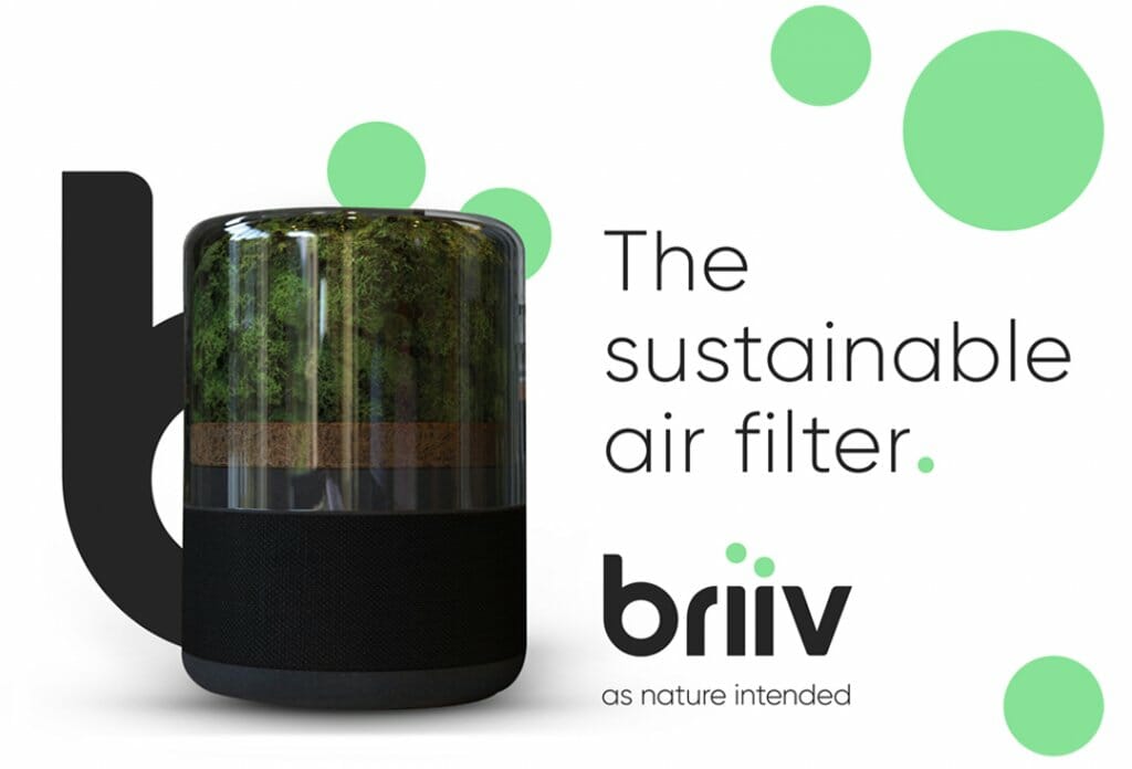
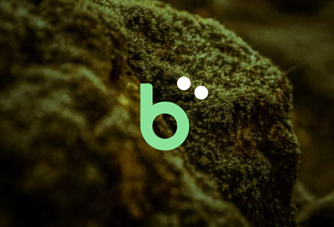
Getting to know the product’s key features and benefits was extremely important to the success of the identity. This allowed visual cues to be created that helps link the brand’s touch points to the product. Simple, clean edges reflect this beautifully intricate product design, whilst the new logo (just like the air we breathe) demonstrates fluidity and gives presence of a product ahead of its time.
These touch points are also present throughout the brand by the use of smaller dots, carefully placed around the ident to represent the particles that are all around us.
Finally, a natural colour palette that’s been carefully balanced between the fresh aspects of nature combined with modern technology was also created to give Briiv maximum impact when applied to various pieces of brand communication. The colour palette once again reinforces the brands’ key USP.