

After a whole year under wraps, Mrs Elswood is finally ready for her close up!
Now in her 75th year as the UK’s number one gherkin brand, Mrs Elswood has been in the market for a makeover for some time, and we’re honoured to say she chose Brilliant Agency as her stylist…
A beloved client of ours for several years, Mrs E (to her friends!) has been sporting the same look and feel since the 1990s, so we were brought on board to bring her into the 21st century.
A simultaenous refreshing and strengthening of the brand values, we’ve spent the last year ensuring their classic SKUs have a new emphatic and bolder presence, all while retaining their iconic presence on shelf.
And where else to start than with the pickle matriach herself?
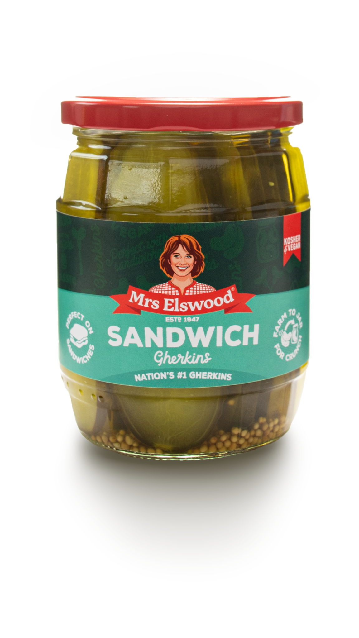
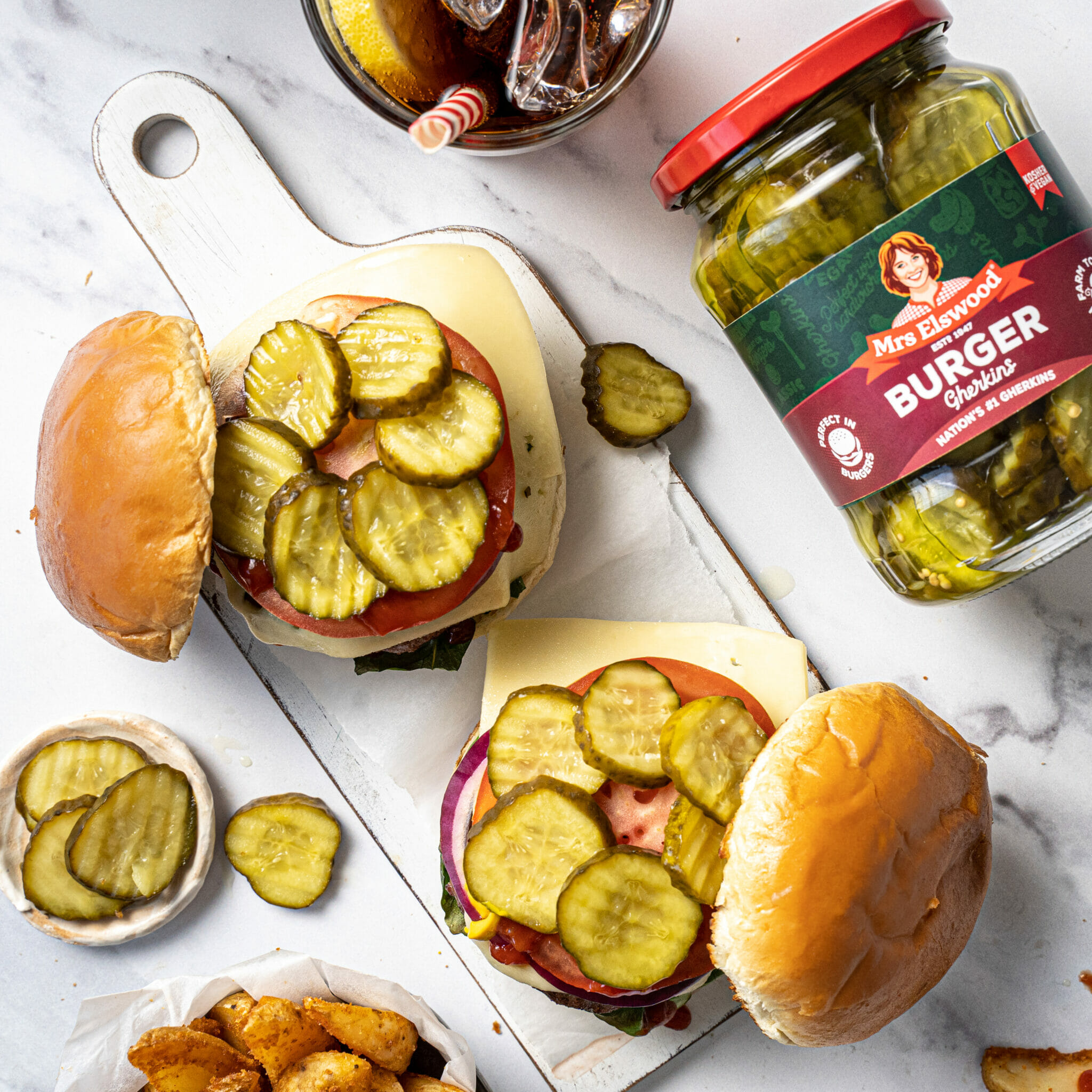
Mrs Elswood first appeared on jars back in the 1970s as a smiling young woman, later being replaced by an illustration which has stayed relatively unchanged since.
But for fans of the product, the character is more than just a mascot. She is the brand, and so it was important our refresh retained all her key assets.
Keeping her warmth, personality and smile, our new vector illustration was developed by the creative team with support from illustrator Myles Talbot, who has previously worked on projects for Pringles, Minute Maid and Asda.
And for 75 years old, we’d say she’s looking better than ever!
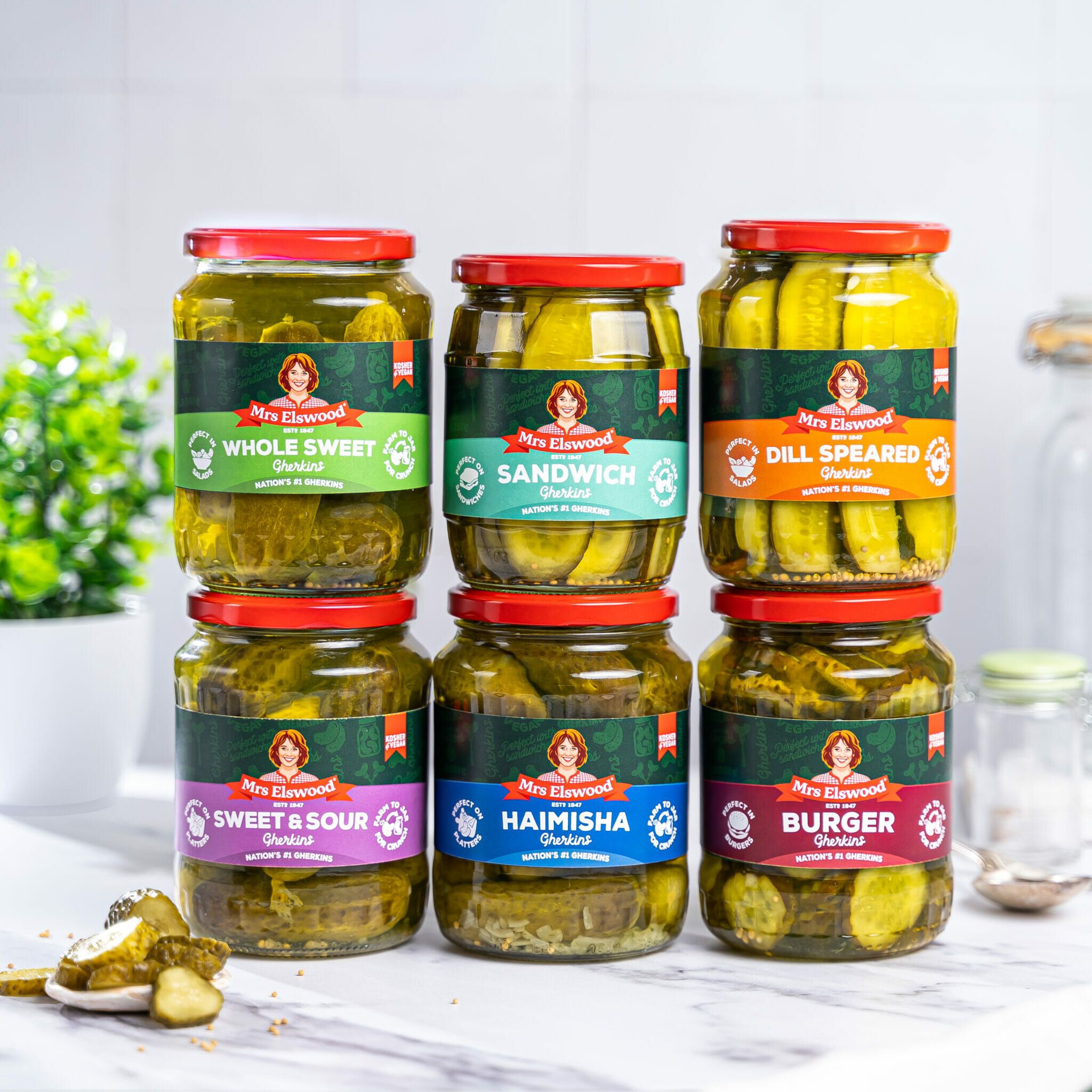
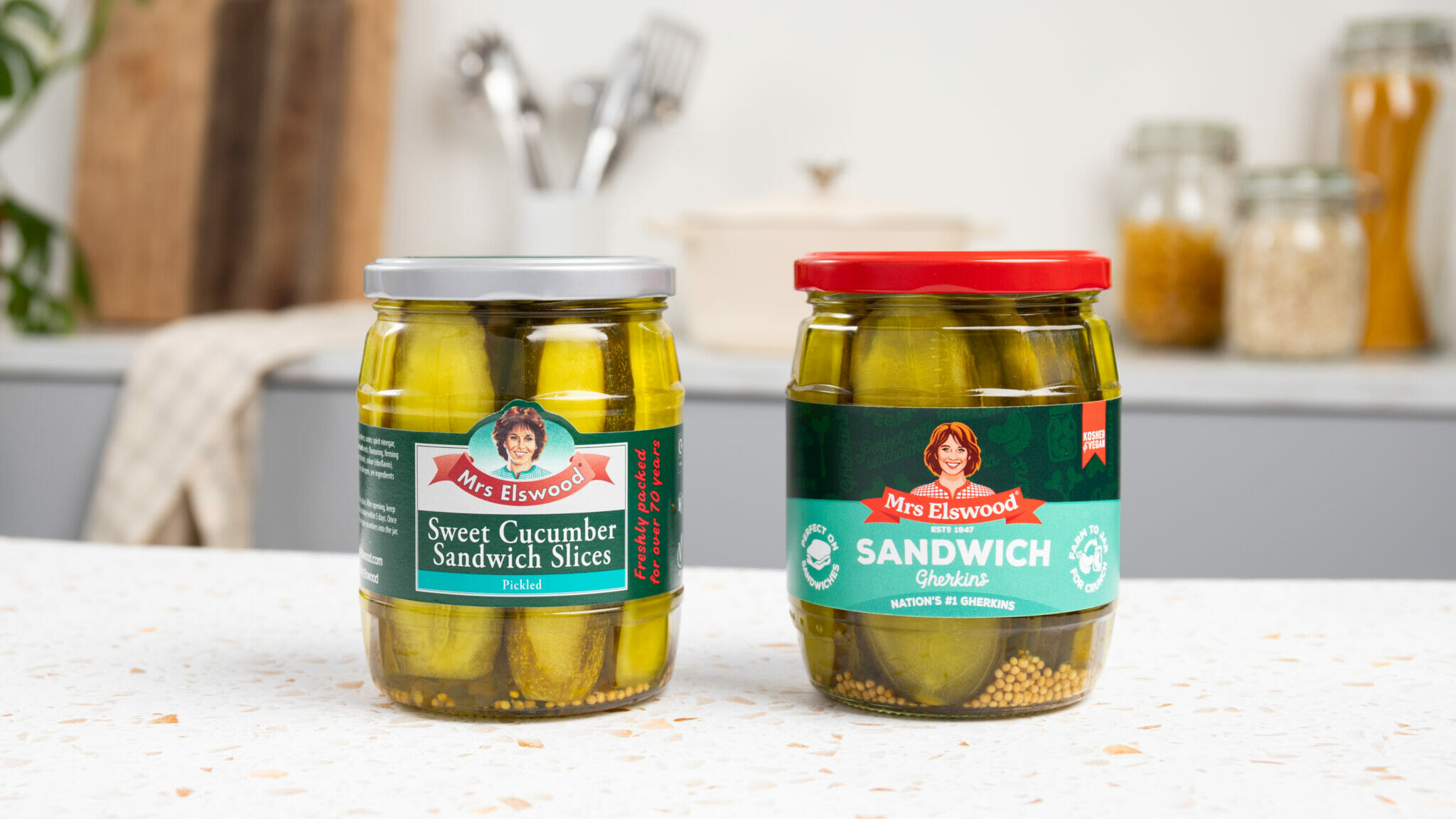
In terms of the jar, we’ve also taken steps to make the colour palette more vibrant and eye-catching, with a stand-out red lid mirroring the classic banner label. The iconic dark green hues have also been maintained for recognition, but subtle patterned assets give it added decoration and appeal.
We’ve also stripped back the oval and rectangular lockup and heroed the colours of each different SKU. These are then accompanied by a new set of more uniform naming conventions, with each jar now being labelled as ‘gherkins’ rather than the more American term pickles.
Our Creative Director Laurra Davis said: “This was a brand evolution with a core character at the heart of it. Ensuring we keep the distinctive elements the brand has built up over decades – the green, the red ribbon and of course, Mrs Elswood herself. Making over such an iconic on-pack character was a huge responsibility, so for us we wanted to retain her warmth, and her motherly qualities whilst bringing her up to date.
Throughout the work we felt it was important to retain the brand’s heritage and recognisable cues, whilst also creating a new naming and colour convention so that each product would be much easier to identify on shelf. The vibrant red lid was introduced to give the jars real shelf stand out and to pay homage to the red ribbon that has become synonymous with the Mrs Elswood logo.”

Brilliant’s creative refresh has helped to consolidate the brand with a new look that feels more up to date and is more relatable to today’s consumer. The new face of Mrs Elswood is now also equipped for the brand to use for digital purposes as the previous illustration couldn’t be used on social media and online.
We’re so excited she’s finally ready for her green carpet debut, and we hope everyone enjoys the new look as much as us.
Mat Moyes, Senior Brand Manager at Mrs Elswood said:
“Mrs Elswood has been growing consistently in recent years, and we felt the time was right to evolve, and to modernise the brand.
Brilliant took time to understand every element of our business from the category to the consumer, usage occasions as well as our heritage – in order to retain all of the core Mrs Elswood values.
We’re incredibly proud of the modernisation work across our brand – and we can’t wait to hear what shoppers have to say!”


